Map Series Columns
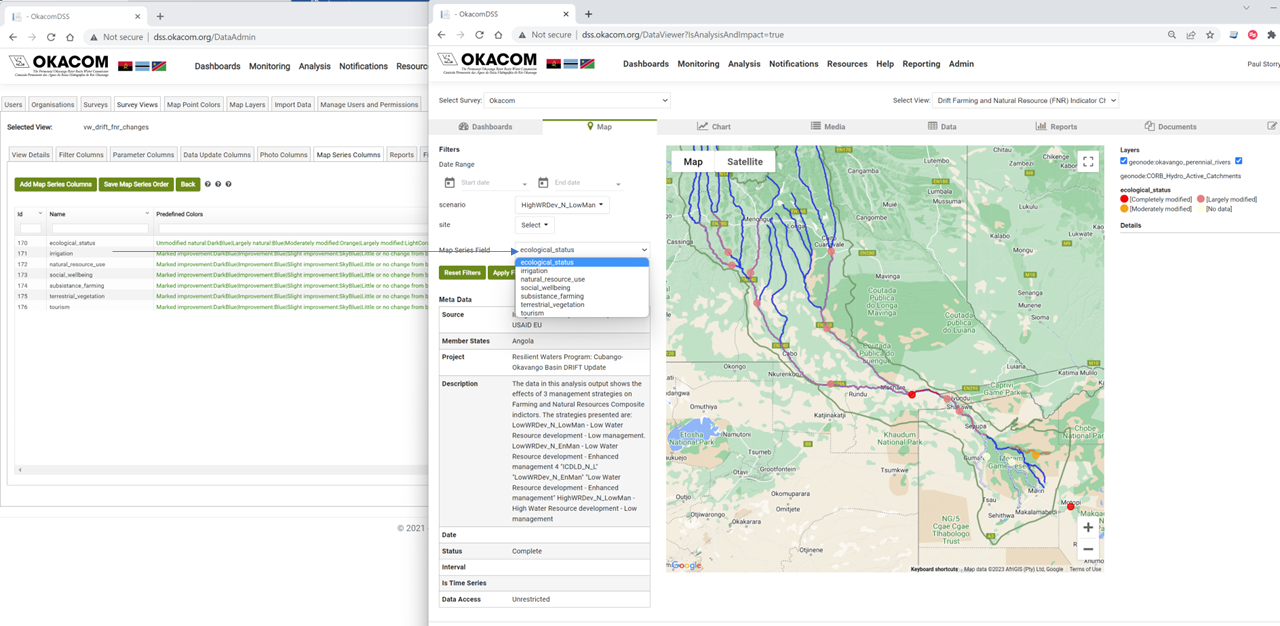
The data points can be themed by colour on the map tab of the Monitoring and Analysis sections. This page allows the columns by which the map will be themed to be selected. In addition, colours for particular values of those columns can be preset. In the example shown, several map series fields are available. These show the modelled effect of different management regimes on each of the indicators modelled in the DRIFT II modle.
|
Map Series Column Names |
Map Series Column Explanation |
|
Predefined colours |
The colours for values are set in pairs of the column value and the required colour, separated by a colon (:) with the pairs separated by the pipe (|) character. In this example, the column value is shown in bold, followed by the colour Unmodified natural:DarkBlue|Largely natural:Blue|Moderately modified:Orange|Largely modified:LightCoral|Completely modified:Red|No data:LightYellow. If predefined colours are not set here, default colours will be used. On some datasets, the map is set to show polygons. More often than not, these polygons need to be transparent to some degree. If this is the case HTML colours can be defined. An example of this can be found in the Flood Early Warning views in the Analysis section. where the colours are defined as 1:#14DE1D40|5:#00FF0070|10:#ff000040. The last two character define the transparency required. the values range from 00 to FF (An explanation of how this works and which values to use can be found here. |
Created with the Personal Edition of HelpNDoc: Write EPub books for the iPad